
The World Beyond Comic Sans and Papyrus
When we started our branding series, we defined your brand voice. Last week, we painted with all the colors of the brand rainbow and picked your brand colors. This week, we’re back with an equally important decision: your brand fonts.
This is one more choice that affects how your target audience perceives your brand at first glance. Your font choices, from the headers on your website to the text on your business card, should communicate the most important qualities of your brand, which, if you've been following our series, you should already know.
Two important things to remember:
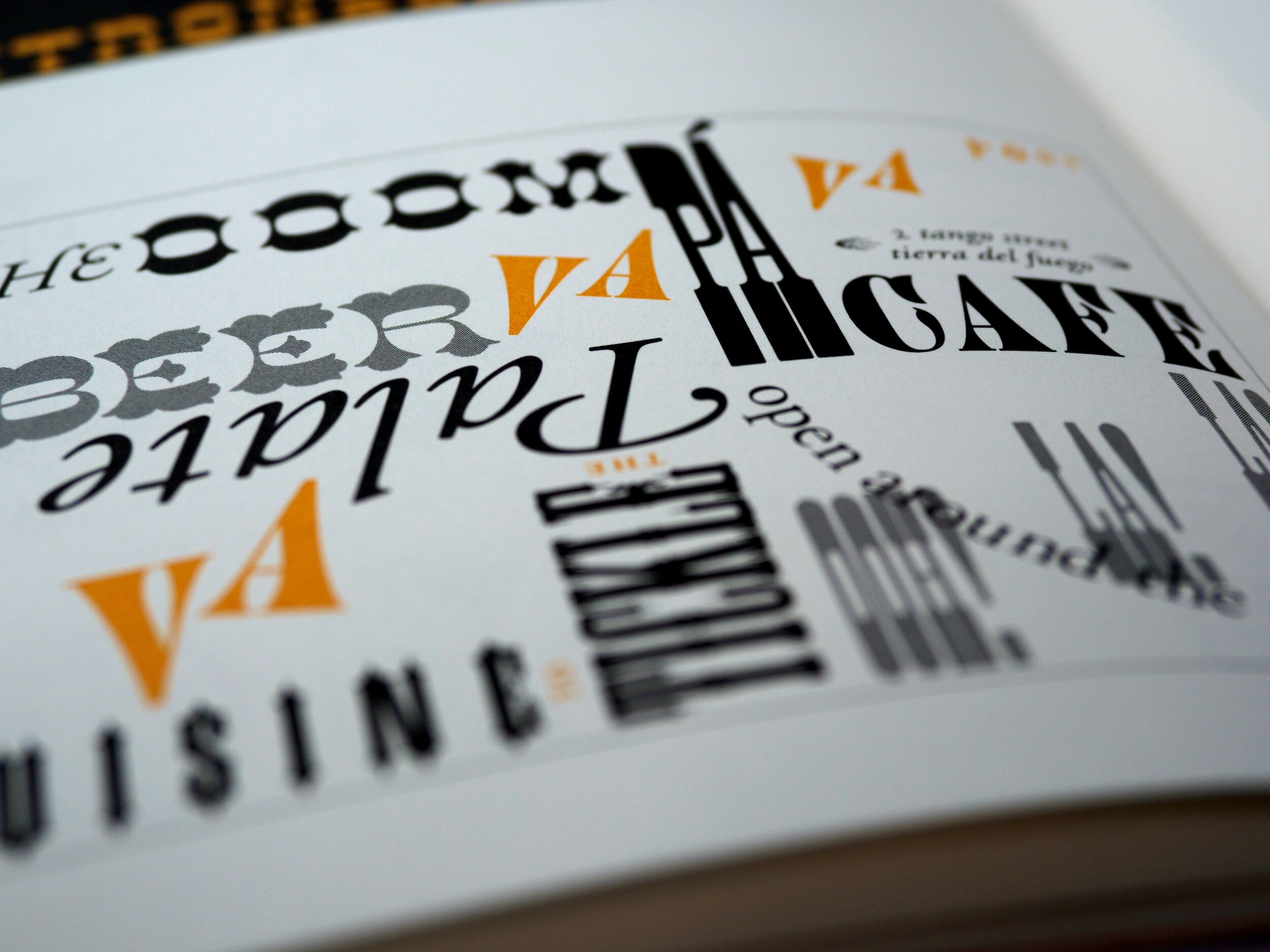
Know the types: Every font can be divided into one of four categories:
Serif: Serif have little feet attached to the font. Like look at this font. You see how the lines help guide your eyes as you read it? These fonts are considered more traditional and serious, and are typically used for long-form text.
Sans Serif: Sans Serif basically means without those little feet. Like this font! This is the same font as above but without the additional lines. See how it looks more modern and clean?
Script: The script family of font contains all those fonts feeling all those handwriting or calligraphy vibes. The letters are all connected and look like a person could be writing it, if their handwriting was really, really good. See a handy list here.
Display: Display fonts are those wildcard fonts that are decorative and grab your attention. Think of fonts you'd use on Halloween or for a children's birthday party invitation; these are not good choices for body text! See some examples here.
Pick at least two: Most people tend to pick two (or perhaps three) fonts for different families of content, such as headers, body text, and for emphasis (meaning a font for quotes, photo captions, etc). Best practice is to pick a combination of fonts that will help you convey a clear hierarchy in your content: A bold font for a header, something a bit lighter but easy to read for body text. Contrast is the key. Use this amazing article for a more thorough explanation on font types, pairing, and suggestions on where to find some great fonts. And Canva also has a pretty solid (and lengthy) guide to this process, too!
There are, of course, a LOT of potential fonts out there in the world to choose from, so one way to start your research is to type some of those adjectives and the word "fonts" into Google, and start browsing. Lots of smart and generous designers have written blog posts and developed resources about different font personalities and recommended pairings (like this one!), and for a beginner it can be really helpful to spend some time seeing what the pros do. You can even use our Font board on Pinterest and get inspired!
Save your favorites to a Pinterest board, and when you've got a good number of choices, look at them all together to see if you've got a certain style or at least a preference coming through.
We wanted to get some more stellar advice on fonts from some experts, so we asked some DC-area designers and consultants. Here's what they want you to know:
“Use a Google font to avoid having different print and web fonts!” -Julie Smith, Designer
“I think it's important to realize that there are characteristics in the design of every typeface that communicate something. You first have to be able to identify what they communicate and then evaluate whether it matches your intent and aspiration. Typefaces should be selected based on their appropriateness, not their ubiquity (e.g., simply choosing a Google font). It's like body language: if your words and gestures don't match, you will not be believed.” -Anne C. Kerns of Anne Likes Red, Inc.
“I always try to pick something really accessible. Your overall design may be great and boutique fonts may be beautiful, but it's no good to anyone if your client doesn't even have the font and won't or can't buy the licenses for it. I'd add that if you are using a desktop or print version of a font, making sure an optimized web version is even available is huge!” -Rebecca Bernbach Graves, Designer
“[Choose] something that's not trendy, so it will not look dated in a few years.” -Colleen Gratzer of Creative Boost
“I just sat through a webinar on storytelling, from a visual perspective: stay away from Helvetica and Calibri because they're too commonplace.” -Tom Sommers referencing a Shine Insight webinar
“The type should be legible in all media, at all sizes. Fancy is fine so long as it is legible and paired with something that scales.” -Katie McCaskey, Content Strategist
"Kerning! Choose a font that is consistently what they want to look at without having to adjust the kerning. This applies especially to businesses where they can’t afford a designer to create their content and make sure it looks clean." -Virginia Case, StraTac Marketing
“Readability is key at all sizes. People can't remember your name if they can't read it.” -Stacy Kleber Jensen of Stacy Kleber Design
"[Choose] something timeless and classic with a pop of freshness for the brand. All those handwritten fonts that were trending a year ago are looking outdated now!" -Erin DeAnna, Curious Caff
And, as Rebecca added, “you can break the rules, but you need some experience to do it well!” We couldn't agree more.
But the nice part about all of this branding work is that it isn't set in stone; you can and should always revisit your branding choices every year or two and make sure it's still working for you. Maybe your target audience will evolve over time as your business grows, or maybe what you're selling will change; it's normal! So stay tuned in and evolve your brand's look and voice appropriately so that you're always putting your best foot forward.